Gushes
As a self-taught type designer who hasn’t worked for a type foundry, the process behind a custom typeface project is pretty opaque to me. In early 2021 I had my first opportunity to design a custom typeface for a client, so I jumped on it and basically winged the whole process.
The project was a success, and I wanted to document it for other independent type designers who might be embarking on their first client project.
The client
Gushes is a UK indie band that commissioned a small custom typeface from me in March 2021. It began as a logotype but expanded into a limited character set typeface for the band to use in album art, merch and other promo materials. The eponymous typeface includes a lowercase alphabet, some punctuation and a few special features.
Project kick-off
After discussing the project with the client, I came up with the following proposal to serve as an agreement before starting the design work.
DESIGN BRIEF
- Designing a display typeface inspired by water as an overarching theme. Think about water in terms of its energy, emotion and flow.
- Specific direction from the client includes using Day 30 and Day 35 from my 36 Days of Fonts project as a reference, but moving toward a heavier/bolder style.
PROJECT DELIVERABLES
- Lowercase alphabet [a–z], an uppercase G, minimal punctuation set (period, comma, apostrophe, hyphen). If there’s anything else you definitely need, let me know.
- Font file in standard formats for desktop and web use (OTF, WOFF, WOFF2)
- Limited perpetual license to use the font for projects related to your band.
REVISIONS
- First draft will show a few key letters to set the overall style of the typeface
- Second draft will incorporate any client feedback and show most or all of the final character set
- Third (final) draft will incorporate any final changes/refinements
COPYRIGHT OWNERSHIP/LICENSING
- When a client commissions a custom font, the way it typically works is, the font designer retains full copyright ownership of the font, which includes the designs of the letters and the font software files. You get a perpetual license to use the font for any designs related to your band, and you own any creative work that you create using the font, like your logo, gig posters, band website, etc.
- If you want to make your license exclusive so that no one else can use it, we can discuss that. I’m an idealist when it comes to arts and culture – I see fonts as a tool for artists to use, and I think making tools accessible to everyone is better. Normally with custom fonts, the client either has no exclusivity, or a period of exclusivity, after which the font designer can publish the font or sell it for anyone to buy/use.
- If/when I decide to put some more work into the font on my own time, with the eventual goal of releasing it to the public, you’ll get all future updates free of charge.
PAYMENT TERMS
- 50% up front and remainder before sending the final deliverables.
My aim was to explain the process and expectations clearly and simply, since the client did not have any experience with commissioning a typeface. This was also my first time designing a typeface for a client, although I’ve been doing general design work for clients for many years.
I summarized the discussions we’d had about the aesthetics and style of the typeface, which was based on … and used my previous Ripple and Ooey typefaces as inspiration.
Design process
I love looking at designers’ notebook sketches. It always feels like an intimate peek behind the curtain of their process — so it’s unfortunate that these days, many designers like myself prefer digital sketching. When your whole process is digital, the only trails you leave behind are when you intentionally make snapshots of your work.

The initial design wasn’t exactly what the client envisioned, but we agreed that it nailed the design brief, and after some discussion we uncovered the missing element: gravity. It was a big change aesthetically from v1 to v2, but an easy change to make. The rest of the project was smooth sailing, and we only went through three rounds before the final typeface was approved.
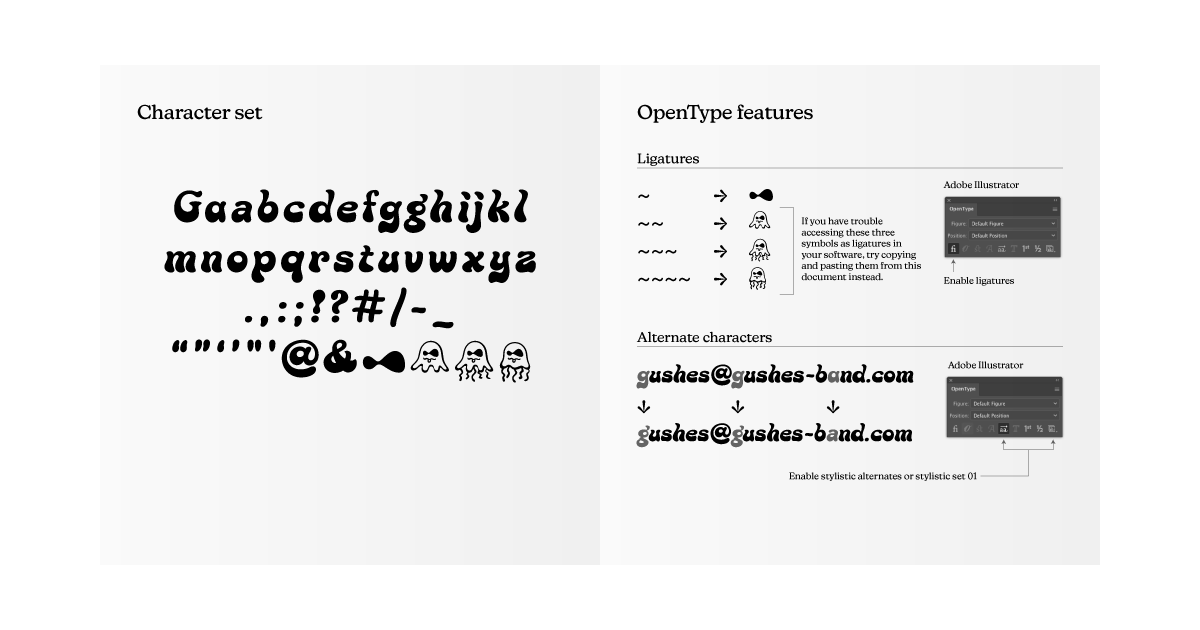
The final character set included just a lowercase alphabet plus a capital G, minimal punctuation and symbols, and a few jelly characters that I digitized from the client’s hand sketches.

The jelly characters were included as liga features (ligatures that are enabled by default) so the client could access them by simply typing the tilde (~) key between one and four times.

Delivery
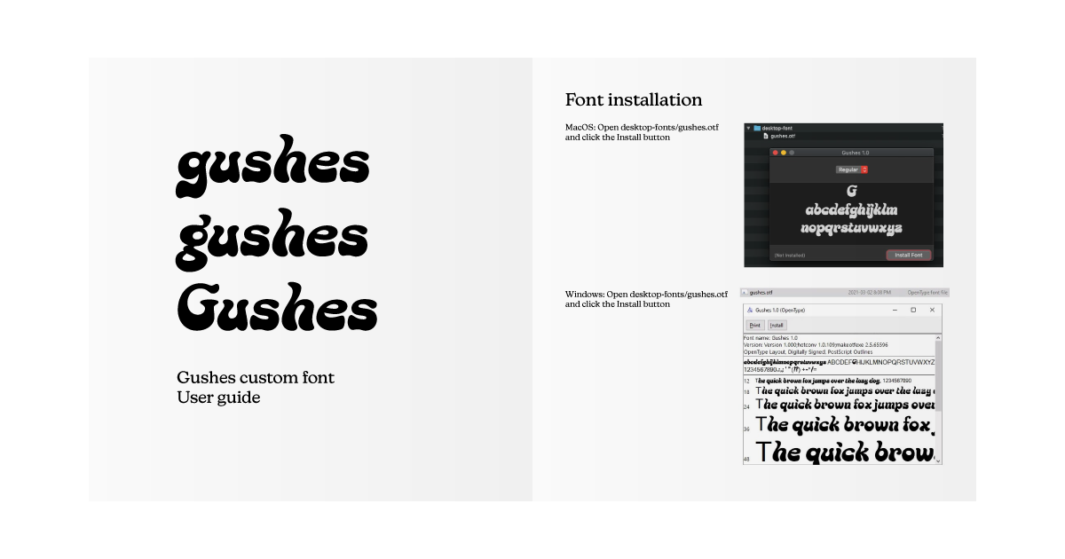
Once the final typeface design was approved, I did some final QA checks to make sure everything looked good and was working as expected in the final font files. I also included a small 5-page instructional booklet to ensure that anyone working with the font would know how to at least install it and access OpenType features in Adobe apps.